Projects/ Catogether
Overview
Catogether is an innovative social networking app designed to make spontaneous meetups effortless. Inspired by Schrödinger's cat, Catogether combines the thrill of randomness with practical event coordination. Here's my journey of transforming social interactions through creative design and intuitive interfaces.
01 Problem 🐣
Motivation
How might we…
02 Define ✍🏼
Pain points

Georgia
Need a way to connect for casual hangouts on short notice.

Liam
Imagine stumbling upon nearby activities without prior arrangements

Oliver
Wish I could easily join spontaneous events without the hassle of planning

Suki
New in town, craving last-minute connections for instant fun.
Competitive analysis
to identify critical features, trends, and gaps in facilitating spontaneous meetups:


Key Findings
None provide features that promote impromptu meetups
Mostly focus on romantic relationships
Very few concerns events based on interests and poor ux
Opportunity
Provide seamless event creation & rapid engagement,
For non-romantic, interested-based activities
Facilitate spontaneous meetups
Principles
Spontaneity first
HMW enable users to effortlessly create and join spontaneous events, removing traditional planning barriers?
Intuitive navigation
HMW create a user-friendly interface that allows users to easily navigate and find events with minimal friction?
Personalisation
HMW tailor event recommendations to individual preferences, ensuring users find relevant and engaging activities?
Vibrant and engaging aesthetic
HMW create a visually dynamic and energetic UI that captures the excitement of spontaneous social connections
03 Develop 👩🏼💻
User flow
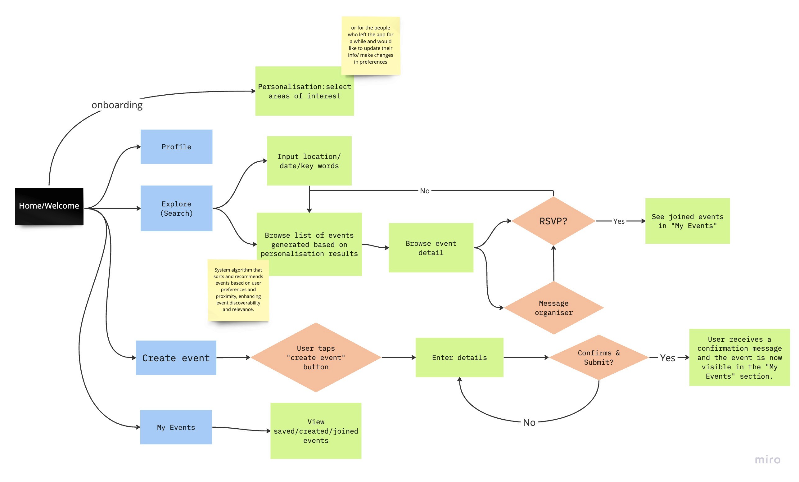
To determine the flow of the app design, i asked myself: well what is the main point of this app, and what is the easiest way to get the users there?
Based on that, i came up with a user flow with three main focus:
Onboarding (personalisation)
Search and join events
Manage events
Paper prototypes
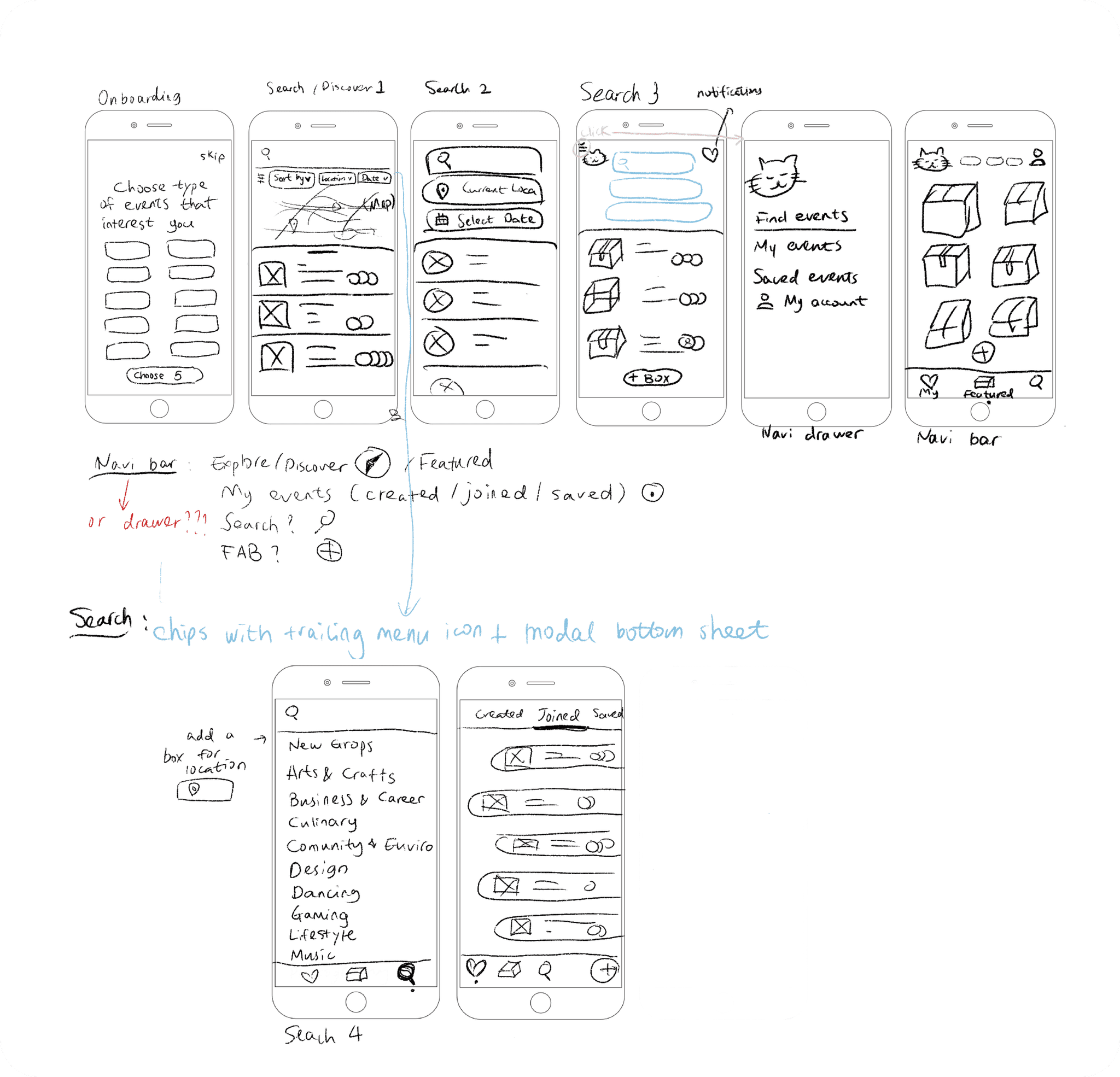
To begin visualising the solution, I created paper sketches. Having a tangible example of the interface allowed me to rapidly critique and adjust my design before taking the time to recreate it digitally.
The famous thought experiment
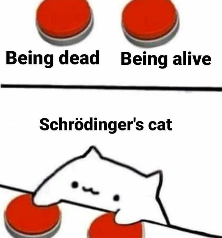
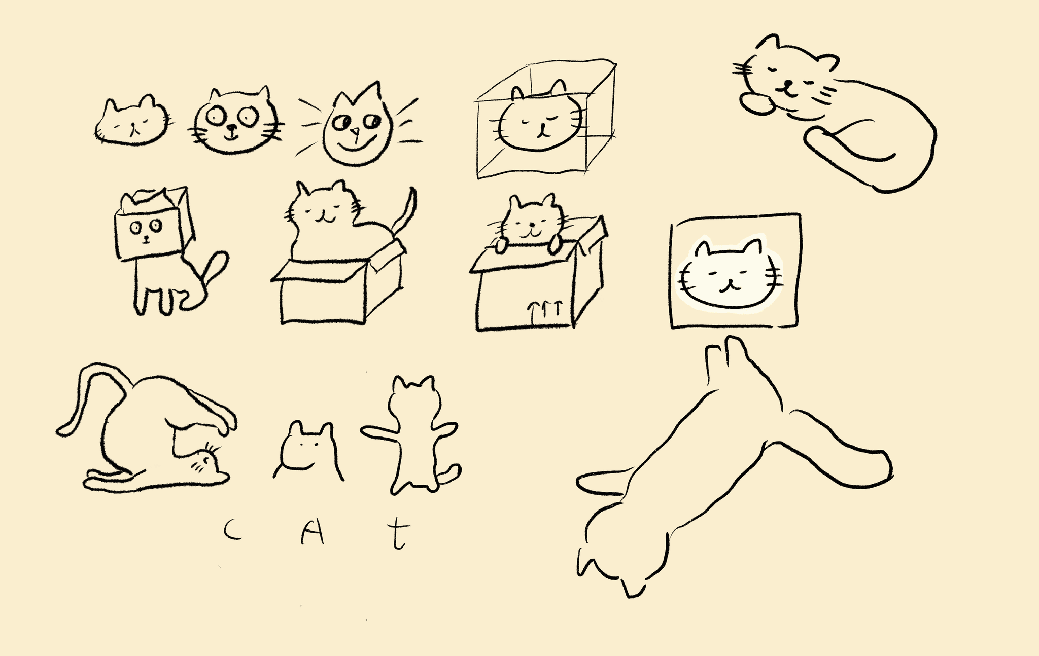
Since the topic is facilitating spontaneous events, the first thing that comes to mind is the famous thought experiment in quantum physics, called schrodinger’s cat.
Branding
So based on that, i drew up some ui elements featuring cats and boxes, lending a a kind of unique visual identity to the app
Personalised onboarding survey
Building on the most effective apps i studied, i found that implementing an onboarding survey for first-time/ returning users, can really help better tailor the content to one’s preferences
Notable feedback
Users expressed confusion regarding the purpose of the 'boxes' concept.
Need for further streamlining the structure of event creation.
Desire for clearer navigation between the 'Search', 'Explore', and 'My Boxes' sections.
Low-fi wireframes
I then set out to create some low-fi wireframes
Testing and improvements
#1 major improvement
implement navigation drawer instead
Based on user feedback, letting the user to naturally flow to other parts of the app seemed to be a better fit
Initially desired bottom navigation to allow ease of adaptation for the user
#2 major improvement
Originally to post events, users have to go to “My events” - “Create event”
Upon feedback, adopting a fab helps users take the primary action by making it visually prominent
Boost user engagement
#3 major improvement
Originally search and results display were on two consecutive pages
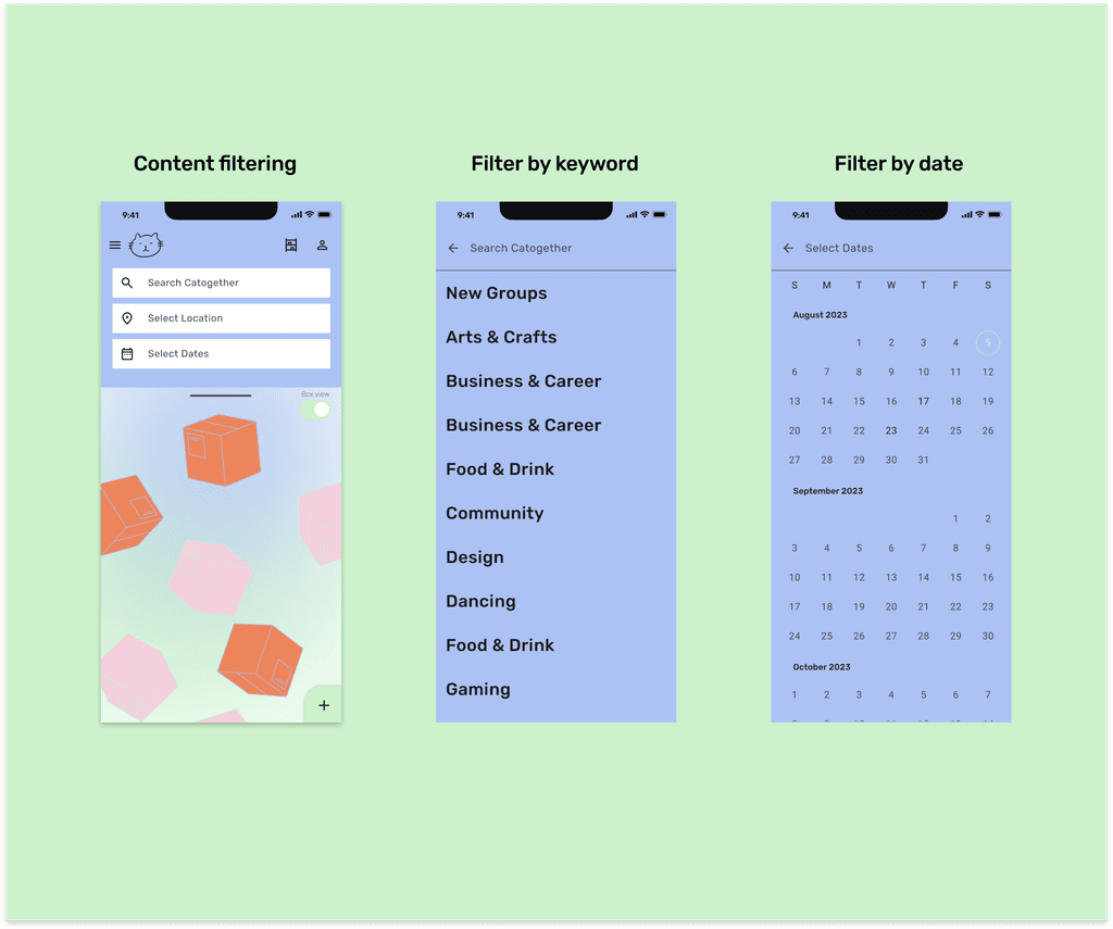
Based on feedback, introduced backdrop as the central framework, housing navigation and filters on its back layer, and main content on its front layer
Allow smooth and efficient navigation, and users to take action on information
04 Deliver 📦
Product architecture
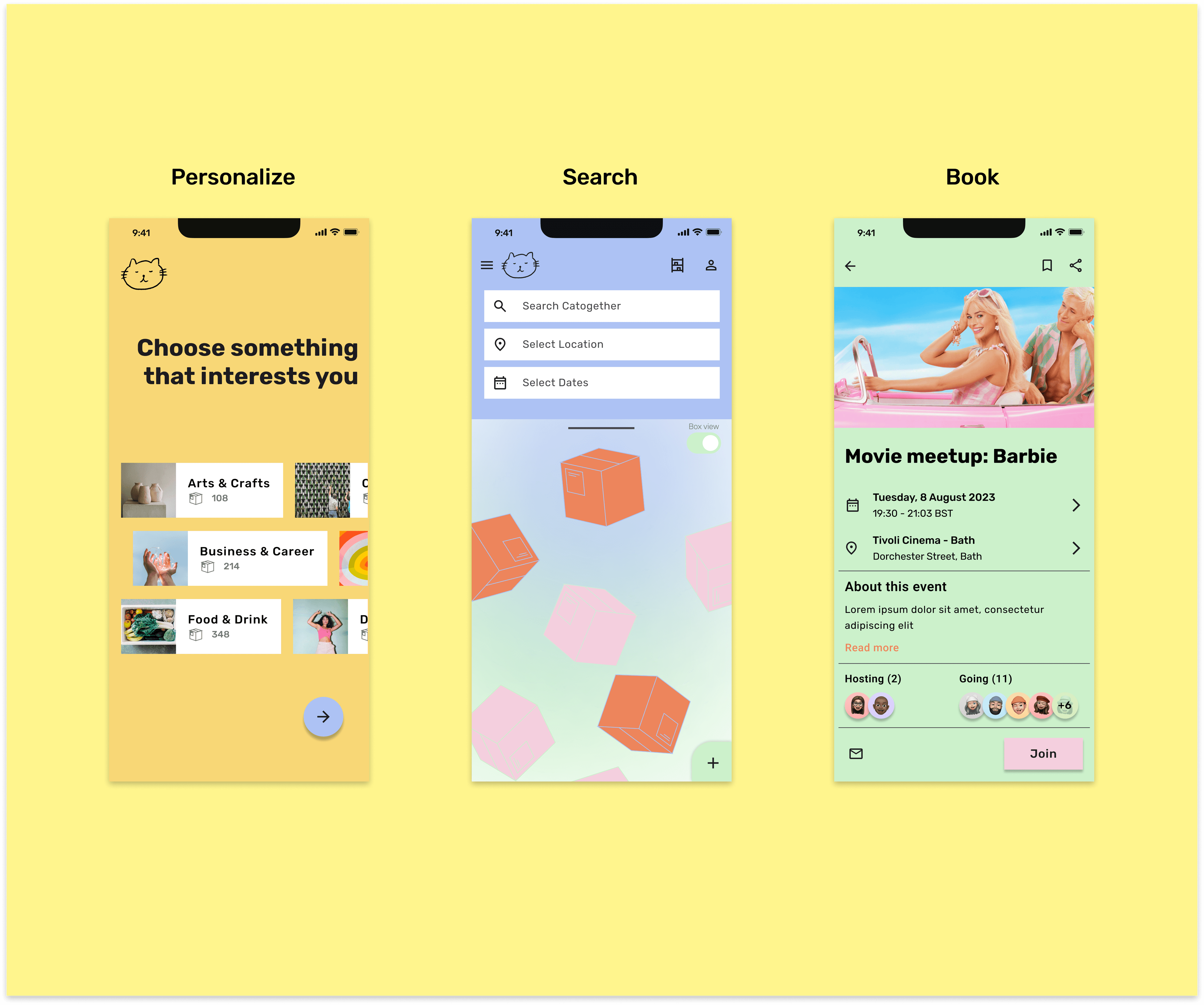
1. Personalise (yellow)
2. Search (blue)
3. Book (green)
Product architecture
A flow-structure is a task-based structure, requiring screens to be accessed in consecutive order.
Back layer: navigation & filters
Front layer: main content
This allows users to quickly move from passively browsing information to taking action on it – all within the same screen.
This design ensures smooth and efficient navigation through flows, simplifying the user experience.
Final design
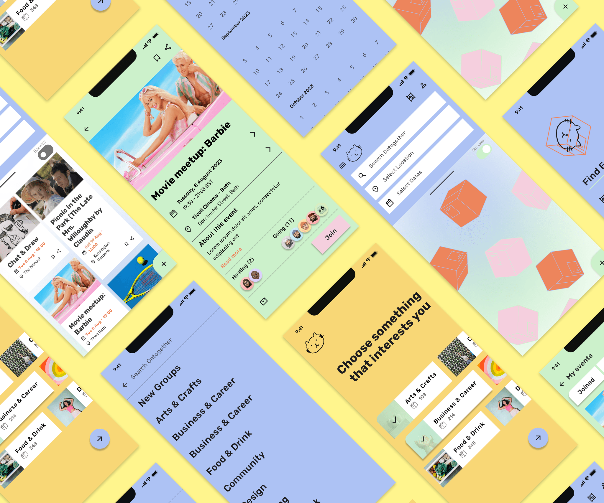
The personalise section is dedicated to curating areas of interest. Serving as a part of the onboarding experience, Catogether utilises this information to craft tailored event recommendations that align with users' preferences.
Final design
Users can quickly customise Catogether's content by using filters on the top of the screen. Nested in the back layer of a backdrop component, these filters will affect the content displayed on the front layer, allowing users to view content tailored to their needs and preferences.
Final design
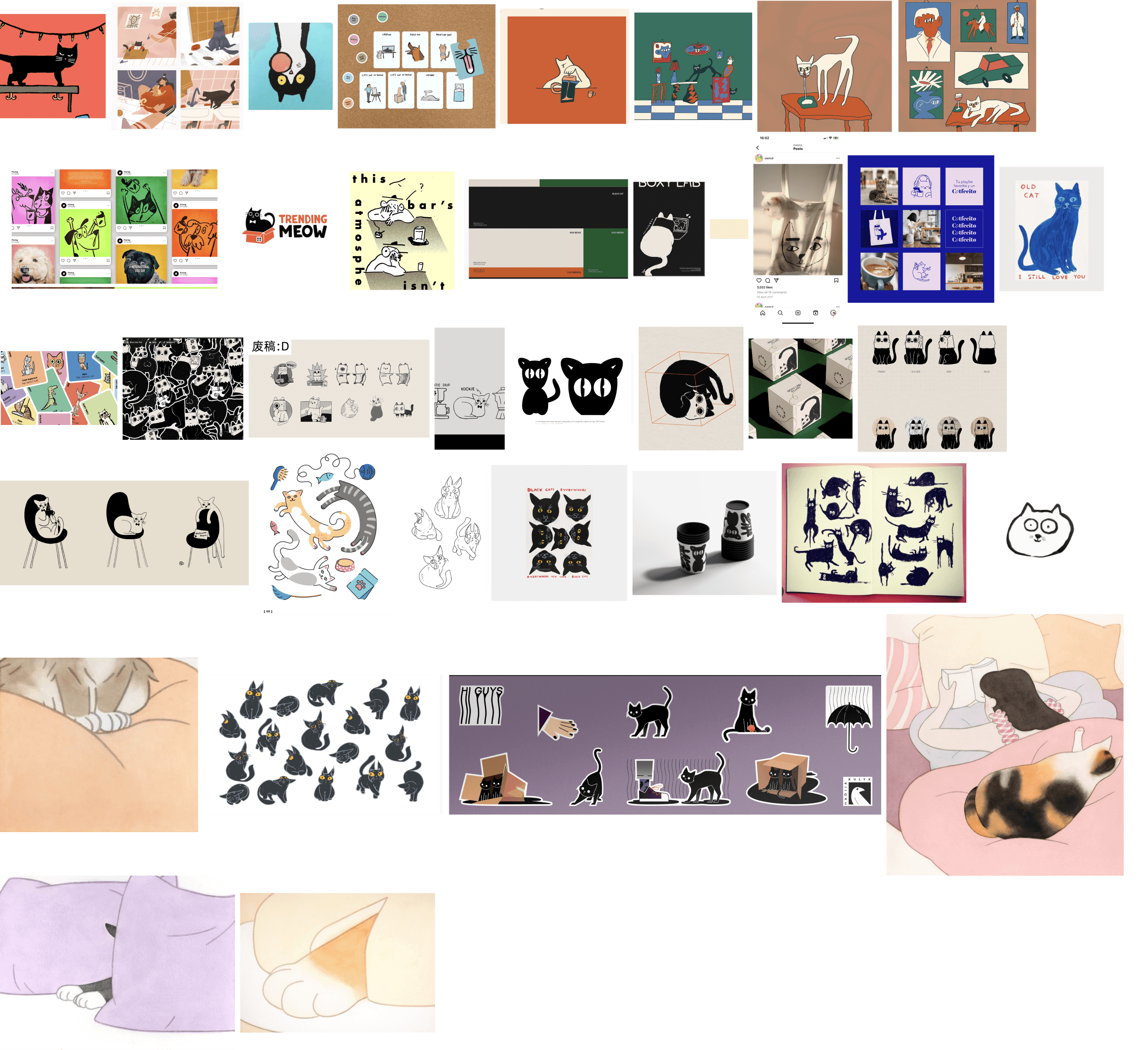
Mood board
Design system
Catogether has three primary colours, each is used to create a distinct visual theme for each section.

Iconography

Typography
Catogether use Rubik as the typeface, and make use of the variety of weights available by using Rubik Regular, Medium, Semi-Bold, and Bold.
05 Takeaways 💭
I gave my best in the design and learnt a ton.
✨ Navigate complexity in Task flow and IA
The most challenging part of Veego was crafting a seamless task flow and sitemap. This process demanded a keen understanding of both user needs and business objectives to develop an effective information architecture that supported fluid user interactions
✨ The importance of planning
Meticulous, early planning is the key to a smooth design process
✨ Simplicity in UI
- Recognizing the power of a simple and intuitive UI design was pivotal.
- Employing visual cues and clear navigation can enhance the overall usability
✨ Incorporating brand attributes
- Infusing the app's brand attributes into design elements enhanced its identity.
- Utilizing color, typography, and visual cues aligned the app's aesthetic with its energetic, daring, and fun persona.
